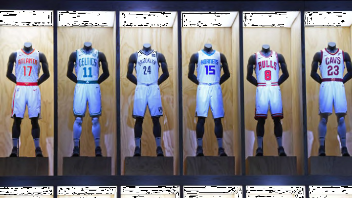
The Brooklyn Nets, along with the rest of the league, unveiled their City Edition uniforms on Wednesday. But how do the Nets new duds compare to their other gear?
While some teams went for eye-catching or strange creations, looking at you Milwaukee Bucks and Atlanta Hawks, the Brooklyn Nets paid homage to their borough. Although at first glance, the Nets’ new jerseys look a little odd, they represent the city well.
Brooklyn Unite#WeGoHard #NikeXNBA pic.twitter.com/rPykGNlziG
— Brooklyn Nets (@BrooklynNets) December 27, 2017
First and foremost, let’s talk about the placement of their team name. For the first time in franchise, the Nets’ full name is on the front of a jersey. While it is a great accolade to have, in hindsight it might not have been the best decision.
More from Nothin' But Nets
- Nets star Mikal Bridges labeled top ‘trade target’ for serious title contender
- LAST CHANCE: Get $2,500 Bonus for Any NBA Draft Bet Before FanDuel Promo Expires Sunday
- Bet365 New Jersey Bonus: Bet $1, Win $200 GUARANTEED on ANY NBA Finals Bet Tonight!
- BetRivers NJ Promo: Bet $500 on the NBA/NHL Finals, Get a Bonus-Bet Refund if You Miss!
- DraftKings New Jersey Promo: Bet $5, Win $150 INSTANTLY on ANY NBA Playoff Game!
“Brooklyn Nets” is arched above the player’s number. The letters “lyn” are at the peak of the arc, with a very awkward looking space on the right. It looks clunky and pretty ugly. The font choice is also questionable. Rather than doing something bold, like the Cleveland Cavaliers did, the Nets stuck with their usual font.
While the front lettering is pretty off, the design of the jerseys themselves is spectacular. the jerseys feature a whitish grey crossing pinstripe. It is just like the cables on the Brooklyn Bridge, one of the most iconic landmarks in Brooklyn.
Although the Nets did not hit it out of the park on the lettering, they certainly did with the callback to the bridge.
Another nice feature are the red, orange, yellow and green dots on the right leg of the shorts. The dots represent the 2, 3, B, D, N, R, Q, 4 and 5 trains, which run through the Atlantic Terminal subway station. It’s a callback to something that is literally at the door of the Barclays Center.
However, I cannot help but be a little disappointed that the Nets ignored the L, A and C train. If you live in Brooklyn you have definitely taken one of those trains. They are as much a part of life as the Nets are.
Overall, I give the uniforms a C+. The lettering is the unfortunately both the most prominent feature and the worst. However, the cabling and little homages to Brooklyn help them tremendously.
